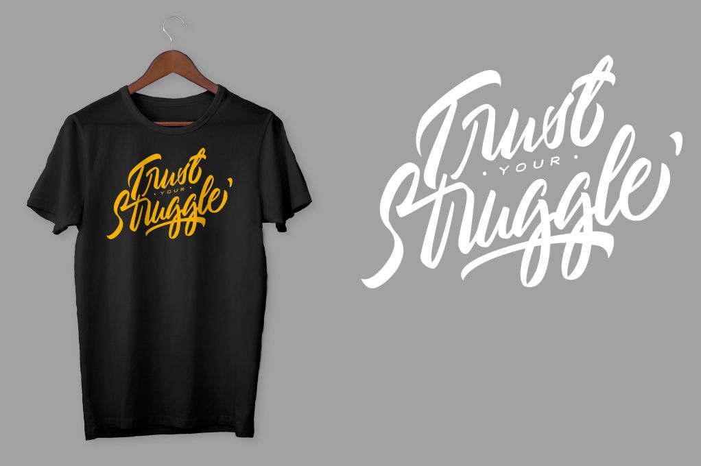
Clone design tips for better POD products – creating high-quality designs with excellent conversion rates.
Using clone design techniques to create your own POD (Print-On-Demand) products is not only a fun and creative activity but can also provide a stable source of income if your designs sell successfully.
So, how can you add more value to your POD products while utilizing clone design? This article by Hac Ecommerce provides six simple clone design tips to elevate your designs and achieve better results!
1. Use Smart Typography
When applying typography, the first crucial criterion in clone design is that the font must align with the image, slogan content, and the intended theme or mood.
While there are plenty of beautiful fonts to choose from, prioritize selecting fonts that are easy to read and visually appealing. For longer slogans, stick to simpler font styles. Additionally, you should explore classic fonts for a timeless appeal.
Golden rules for selecting fonts:
- Limit font variety: Avoid using more than two fonts in one design to prevent it from looking cluttered or confusing.
- Avoid font conflicts: Don’t place two contrasting fonts side by side, as this can give the impression of a printing error on your POD product.
- Balance uppercase and lowercase: A harmonious combination of uppercase and lowercase letters can make your POD designs clear and visually striking.

2. Pay Attention to Color Coordination
Beyond aesthetics, colour plays a vital role in clone design by evoking emotions and enhancing customer memory of your brand. Proper colour usage can stimulate sensory connections, swiftly communicate your message, and reinforce product imagery.
Monochromatic Colors

Monochromatic colour schemes are a simple yet effective way to create visually pleasing designs. This approach uses a single colour in varying shades and tones to produce a harmonious effect.
Analogous Colors

Analogous colour schemes involve combining colours that are adjacent to the colour wheel. This method offers more variety than monochromatic schemes and helps highlight different sections of your design, making it easier for customers to distinguish key elements.
Complementary Colors
Complementary colours are opposite on the colour wheel and provide a high contrast level. This approach, known as direct complementary colour coordination, makes your design stand out and grab attention.
For a softer impact, you can opt for split complementary schemes, which incorporate more colours while reducing the intensity of the contrast.
Triadic Colors
Triadic schemes use three colours evenly spaced on the colour wheel, forming an equilateral triangle. This technique is perfect for creating unique and eye-catching designs, adding vibrancy to your POD products.
3. Keep Your POD Designs Simple

Minimalist design is a rising trend, especially in clone design for POD products. In the past, customers were overwhelmed with overly detailed designs, making it hard to remember or connect with any specific element.
While some intricate designs may succeed, most customers prefer clean, straightforward concepts. Focus on simplicity and clarity to make your designs more memorable and appealing.
Why simplicity works:
Simple and modern designs are often more relatable and easier for customers to connect with than complex, multi-layered designs.
4. Achieve Visual Balance in Your Designs

Visual balance is a cornerstone of effective clone design. A lack of balance can make viewers uncomfortable and disengaged. When a POD product is visually balanced, every element receives appropriate attention, creating a cohesive and attractive design.
Symmetrical Balance
Symmetrical balance involves arranging elements evenly on both sides of a central axis. This type of balance conveys elegance and formality, making it ideal for simple designs with minimal text.

Asymmetrical Balance
Asymmetrical balance involves arranging elements with varying weights, such as sizes, colours, or shapes, to create a dynamic and modern look. Although challenging, this balance brings energy and vitality to your POD products.
5. Utilize White Space Effectively

White space doesn’t have to be white—it can be any background colour that complements your design.
In clone design, proper use of white space can enhance your design’s appeal and prevent it from looking overcrowded. White space highlights the creative elements of your design, making the overall concept more transparent and impactful.
Benefits of white space:
- It acts as a visual rest for the viewer.
- Emphasizes key elements of the design.
- Creates a clean and professional look.
6. Add Humor to Your Designs

There’s no rule against incorporating humour in clone design. Adding a touch of humour can make your POD products stand out and leave a lasting impression on your audience.
Funny and creative elements can also help your designs go viral, attracting more customers and boosting sales.
Conclusion
Creativity is key in clone design. However, remember that some designs may need adjustments depending on the placement or product they’re printed on.
If you’re looking for assistance with clone design, fulfilment services, or payment gateways, Hac Ecommerce supports your business journey. Reach out to us and eliminate any hurdles in your operations.
🚀 Start creating impactful POD products with Hac Ecommerce today!

